


Bridge the Gap: Digital & Print Design
Bridge the Gap: Digital & Print Design

May 1, 2023
Updated:
May 1, 2023
Featured & Recent Articles


.webp)


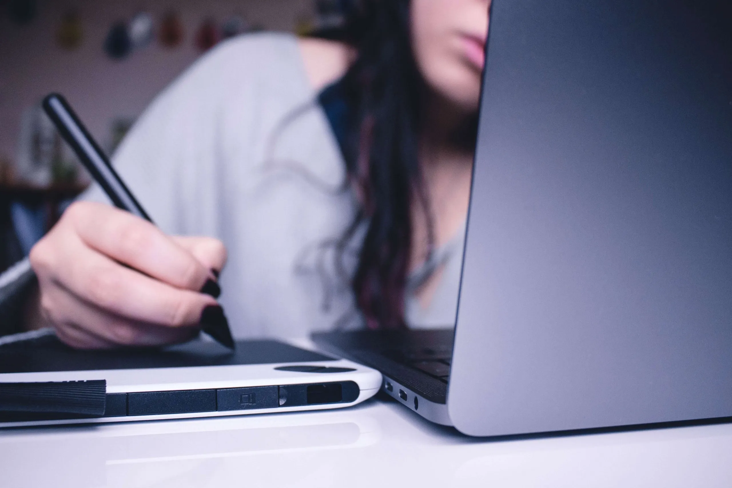
Being a graphic designer has been my passion in life for about 7 years now. When I began learning about graphic design I was working in a print environment. I taught myself the basics and then started college, but still what I mainly learned was based around print design. I never stopped to think about “what if I got a job in digital design”, I was just excited to learn as much as I could. From the moment I started my job here at Red Shark Digital, my graphic design world has been flipped upside down. The following are a few of the obstacles I have been faced with.
DESIGN EXPERIENCE
The biggest hurdle that I’ve had coming into this position was my experience. Like I said, everything I knew and was good at, was based around print design. Print design has options such as textures, shapes and embossing for example. All of those little things that I was used to using to catch someone's attention were now pointless. Jumping into this digital design world has forced me to sit back and say to myself, “Okay Caroline, how can you catch the audience's attention?”. I have spent hours at work and at home learning how to catch someone's attention digitally. Audio and video are the best ways to capture attention for digital design. If you compare digital to print, the most obvious difference is that there is no tangible item to see/feel, so making a video or audio based design is the most effective way in digital design to convey your message.
ABILITY TO CHANGE DESIGNS
Digital design gives you the option to make edits to all of your designs, even if they are already out on the internet for the world to see. Print design on the other hand, is not quite so forgiving. Once your flyer, catalog, etc. is printed and sent out, that's it. If there are any mistakes, there is no hope on getting 700 more catalogs printed and resent. Whereas with a digital design if you made an error just simply fix and reload it. Boom. Done.
USABILITY & NAVIGATION
Navigation of print design is pretty straightforward and simple. Your design is limited to the size and shape of your piece, and the navigation is simply flipping or unfolding a page. When we move to digital design on the web, this is no longer so straight forward. You can’t make one ad in one size and think it’s going to fit everywhere. Instead, you’ll need to make the same ad in multiple sizes. Same goes with building a website, now you need to make sure the website that you design is responsive for different devices.
LAYOUT
The one common factor between digital design and print design is design elements. When it comes to typography, graphics, shapes, lines, color, etc. most of the elements apply to each. Even though these elements are involved in both types of design, they both have unique requirements. When designing for print, your design obviously cannot go outside the surface that you are printing on. When it comes to the web a designer has so much flexibility to change around your information.
SIZE
In print design the size of what you’re printing on is what your entire design is based off of. For example the design elements that you use, the amount of text, the size of text, etc. Even though most items have a standard size, sizing is really an unlimited realm since most printing surfaces can be customized to any size and/or shape. When it comes to digital design, size becomes a little different. Sizes are usually limited to the number of devices available, so that your content can scale from a phone screen all the way to a computer screen.
RESOLUTION
Pixelation will occur when the PPI (pixels per inch) isn’t high enough for printing, or an image is displayed online at a larger size than the original dimensions of the image. When referring to digital design, most screens that we use today have a predetermined resolution. The general standard is 72 PPI, although as more and more devices are coming out with high-resolution displays, this will most likely be changing.
FILE TYPES
As a designer, there are SO MANY file types that you can choose from. The easiest way to cover these is to just list them outPrint & Web:
- JPG: This is the most common file type that most people who aren’t even designers know about, as it is the default file format for most digital cameras. JPGs MUST be saved with correct resolution and color space (CMYK for print & RGB for web)
- PDF: This is another widely used format. PDF does a great job at preserving the original content of the design no matter where or how it is viewed.
- EPS: An EPS is mostly used for saving vector graphics to save their scalability.
- PNG: PNG has high image quality and supports transparency/opacity.
Web Only:
- GIF: A GIF uses graphics with animation or some kind of transparency effects. They don't hold color values as well as a jpeg, but are the best for any kind of animated graphic on the web.
- SVG: This is a vector format that can be enlarged or shrank to any size and won’t lose any quality
Print Only:
- TIFF: Compressing a TIFF file does not reduce your image quality, unlike a JPG. It can hold high image quality and large file sizes, all while being compatible on Macs and PCs. This file type is mainly used as your final design to be handed over to a printer.
COLOR
Color is the easiest and biggest difference between digital and print design. CMYK is for print design and RGB is for digital/web design. Let's break this down, starting with print. CMYK stands for Cyan, Magenta, Yellow and Black. CMYK colors are identified by codes that give the percentage of each type of ink required to make that exact color. For example, the blue that’s used in Twitter's logo is 70/10/0/0 (70 Cyan Ink/10% Magenta Ink no yellow ink and no black ink). If you went to your color tab in CMYK mode and put in those numbers you would come out with a blue that matches Twitter's logo exactly. The biggest thing to remember when designing in CMYK mode is that your design will not look the same when printed as it did on your screen. Now, moving on to digital/web design. RGB deals with the colors displayed on a screen/monitor. This shows up as dots of red, green and blue lights to combine and make what you see in front of you. RGB colors are represented by 3 sets of numbers that refer to the amount of red, green and blue lights used to make an individual color. If we go back to the Twitter logo, in RGB mode you would type in 85/172/238. Getting your colors to be consistent between different deliverables can be tricky. The best way to ensure that is to use the Pantone Matching System. Pantone colors each have their own reference numbers that differ from the color codes associated with CMYK and RGB. Pantone colors make it super simple for designers to make sure their final products have the intended colors.
TYPOGRAPHY
If you have a second, go try to download a free font to your computer. The first thing that you will notice is that they come in 2 different options: Desktop or Web. Desktop fonts are usually licensed to that one user to install on their computer and can be used in different ways, mainly for print design. Web fonts have been made and optimized specifically for website use. There used to be a very limited range of web fonts, but that is slowly changing. The way fonts are handled are very different between digital and print. In print, the options are endless. Your design has to simply be based on what your client wants, and as a designer you have complete control over how your fonts look. However with digital, a designer would choose only fonts that display cleanly and are the easiest to read. As a designer, you have way less control over how the fonts are display, and have to focus more on how to enhance readability.
CONSTRUCTION
If there is one thing that all designers can agree on, it’s that every designer has their own process. When it comes to web design, your process will have a greater effect on your final project than in print design. In print design, most designers know and acknowledge that there's more than one way to achieve a design. As long as it looks good when you get done, how you got it done isn’t very important. A viewer looking at your flyer has no way of knowing how you made that flyer. With web design, it’s a little different. And by a little, I mean alot. How you put a website together, the guts of the website, most definitely influence the final project. Mainly affecting usability (how someone finds things on the site) and visibility on a search engine.
One Focus:
Keeping You Up To Date.
Digital marketing news delivered to your inbox without the fluff...Maybe a little fluff....The cute kind 🐶!

