


Dos & Don’ts For Graphic Design Greenville, NC
Dos & Don’ts For Graphic Design Greenville, NC

May 1, 2023
Updated:
May 1, 2023
Featured & Recent Articles


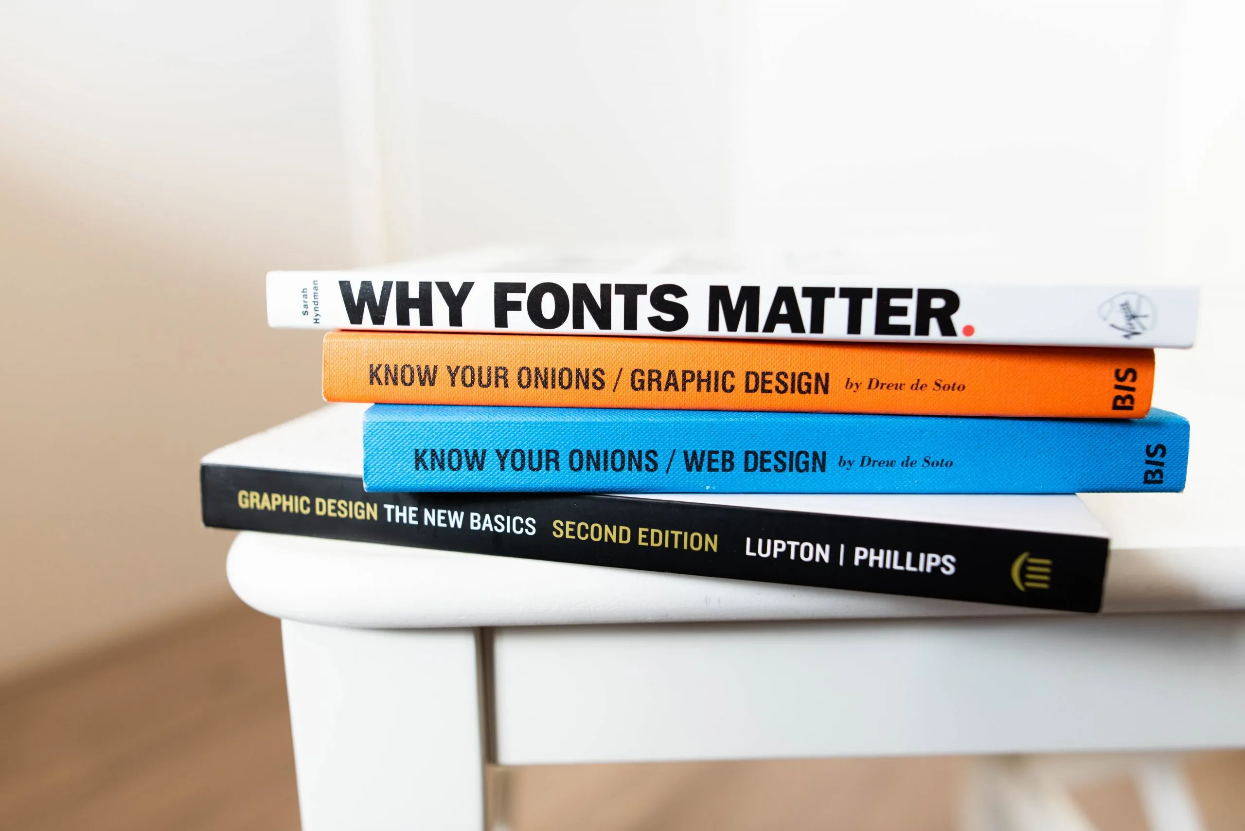
Color Combination

Do: Use a limited amount of colors in your design. It’s best to stick with a consistent color scheme that you know works well for graphic design Greenville NC. This keeps your designs from becoming too chaotic, as well as helps you develop consistent branding. Don’t: Don’t place type over a background that is too similar in hue, saturation, or value. Type needs to have a higher contrast so that the viewer can read it without straining. Be careful of certain color combinations. Color schemes, such as complementary color schemes, need to be reworked before they can be used successfully in a design. Altering the saturation values of the colors is one way to make the combination work better.
Type Spacing

Do: Make sure you have spaced your type well before implementing it in your graphic design Greenville NC. The type needs to be close enough to easily fit all your information in, but still spaced enough so that it is easy to read. A quick beginner’s test to check your type spacing is to look at it from an arms length distance and squint your eyes. If the text blurs into either a white or black chunk, the spacing is off. There should be a color balance between the text and background color. This is easiest to do with a test print of your text. If your Greenville, NC marketing is only digital, don’t base your spacing decisions off of prints.Don’t: Kerning is the space between letters. The kerning shouldn’t be tightened up to the point that letters in a word are on top of each other. The same thing goes for the leading. Leading is the vertical distance in between lines of text. Similar to kerning, the leading shouldn’t be decreased to where the lines of text are touching each other.
Balance

Do: Designs need to have balanced weight so that the viewer can easily take in the information. There’s a few different ways to achieve balance but one of the ways is through symmetry. Correctly using different forms of symmetry will add structure to your marketing in Greenville, NC. Asymmetry is another way to balance out your designs. Don’t: Don’t cram all your content together. Negative space can make or break your design. It adds visual interest. When used improperly, it will make your design look rushed and too crammed to read. Successful graphic design in Greenville NC will utilize negative space for balance.
Hierarchy

Do: Make sure your possible clients are looking at the important part of your design. Hierarchy is important in your Greenville NC marketing to make sure the viewer knows what it is you’re trying to market. A couple ways to establish hierarchy is through size and color.Don’t: Don’t make all your text the same size and weight. Not only does this visually look boring, it won’t distinguish any important information for the viewer. An eye-catching title will lead the viewer into the rest of the information. Using a heavy weight or large point size for your body text will make the viewers focus on the wrong thing, missing essential information to make the content understandable for graphic design Greenville NC.
Graphic Design Greenville NC
Above are our design tips for beginners in graphic design Greenville NC! Looking for more tips and tricks? Check out our creative resources for graphic designers, digital strategists and marketing managers to ensure your content is top notch. For all needs Greenville NC marketing related, contacted Red Shark Digital today!
One Focus:
Keeping You Up To Date.
Digital marketing news delivered to your inbox without the fluff...Maybe a little fluff....The cute kind 🐶!

