


Common Design Trends In 2019
Common Design Trends In 2019

May 1, 2023
Updated:
May 1, 2023
Featured & Recent Articles


.webp)


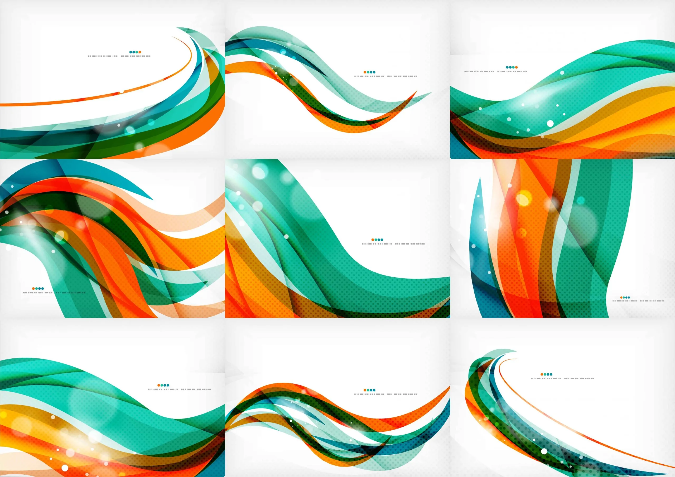
Similar to the tide, design trends tend to ebb and flow. If you were to explore current design trends, you would find that gradients are very popular. Although, many people don’t recognize them or understand their emphasis. A gradient is simply a color transition from one solid region to another. This method allows designers to create new elements by blending colors. By doing this, colors that may have been limited before, come to the forefront. This trend is expected to expand in popularity and diversify over time.
Types of Gradient
Among the many ways to create a gradient, the most popular gradients include using duotone hues, tri-color, multicolor, and blending methods. The designer must take into consideration the multitude of parameters they have available to use, including the gradient direction, opacity, and orientation. Each of these methods is imminent in attracting the attention of the human eye.
Where do we see them?
Gradient usage is essentially limitless, with bright and vivid colors in order to engage viewers.


As seen above, large companies like Spotify and Apple are keen on using intense gradients, which accentuate their products and draw in users. Some of Spotify’s most popular campaigns use gradients with other artistic elements, such as applying a duotone effect to their images. Another great example of this recent trend is Instagram’s new logo design.

In 2016, Instagram modernized their previous, dated logo. The new logo is more representative of Instagram’s energetic community. Many users were not fond of the logo switchup, criticizing its minimalistic feel. Others believe the gradient is similar to Apple’s iOS apps and user interface design choices. Although, others resonate with the design, stating that the colors evoke positive emotions.
Gradient in User Interface Design
Gradients tend to be refreshing to the eyes and elicit enthusiastic feelings amid users. Gradients demonstrate a great way to make your audience feel a certain way, guiding the viewer’s eye from one region of the site to another through the changes in color values. The use of gradients in UI elements makes for cutting edge designs, giving the platform a unique and contemporary composition.
One Focus:
Keeping You Up To Date.
Digital marketing news delivered to your inbox without the fluff...Maybe a little fluff....The cute kind 🐶!

