


Leverage Webflow UI Design Tips to Boost Site Conversions
Leverage Webflow UI Design Tips to Boost Site Conversions

August 8, 2023
Updated:
August 8, 2023
Featured & Recent Articles


.webp)


Nothing happens by accident. The same is true for User Interface (UI) design. Every element of design on any website deliberately boosts website conversions. Studies show that 53% of mobile website users will leave after 3 seconds. You don't want that to happen to your website. Leverage UI design to reduce bounce rate and boost conversions.
The effort you put into the UI design of your website determines whether users will convert to customers or bounce off your website as soon as they get there. These integral details are why you must be deliberate about leveraging UI design to grow your website conversion. Read on to learn from our Webflow SEO agency how you can boost conversions with your UI design.
UI Design: What is it?
User Interface (UI) design is a digital product's appearance, feel, and interaction. UI design uses different elements to create visually appealing interfaces that are intuitive to navigate.
This process covers three primary aspects, namely:
- Visual design: this is about the appearance of the interface and components like typography, color, logo, graphics, and spacing, among others
- Interaction: this refers to how various elements interact within the interface
- Information architecture: this concerns the organization and labeling of content within the interface
What is the difference between UI and UX design?
User Interface (UI) design has to do mainly with the design and aesthetics of a product, while User Experience (UX) design prioritizes the overall user experience. While UX strategy deals with the comprehensive journey of a user from beginning to end on a product, UI design focuses on visual touchpoints and interactivity.
The UI Design Process

There is a process for UI design. While different teams may follow unique systems, the principles lead to the same results. Find below the basic steps in UI design.
Understand UI Design Problems
The first step in the UI design process is to understand the design problem to be solved. The design team needs to understand and define the problem before designing. At Red Shark Digital, our Webflow SEO experts work with the design department to collaborate on problems developers can fix with UI design. Webflow agencies commonly use Design briefs to identify current website issues. These briefs have all the details of the design project.
Competitor Analysis for Web Design
There is nothing new under the sun. What you’re aiming to design has most likely been created by other teams. Usually, design projects improve on products that are already available. Look for similar products and see how they are displayed. Note the good aspects as well as the aspects that need improvement. In-depth competitor analysis gives you ideas for the project.
Establish UI User Flow
User flow is where you decide what your screens will look like. Consult the user journey to ensure a smooth flow of screens. Also, consult the user flow. The user flow is interactions between screens as the user continues on their journey.
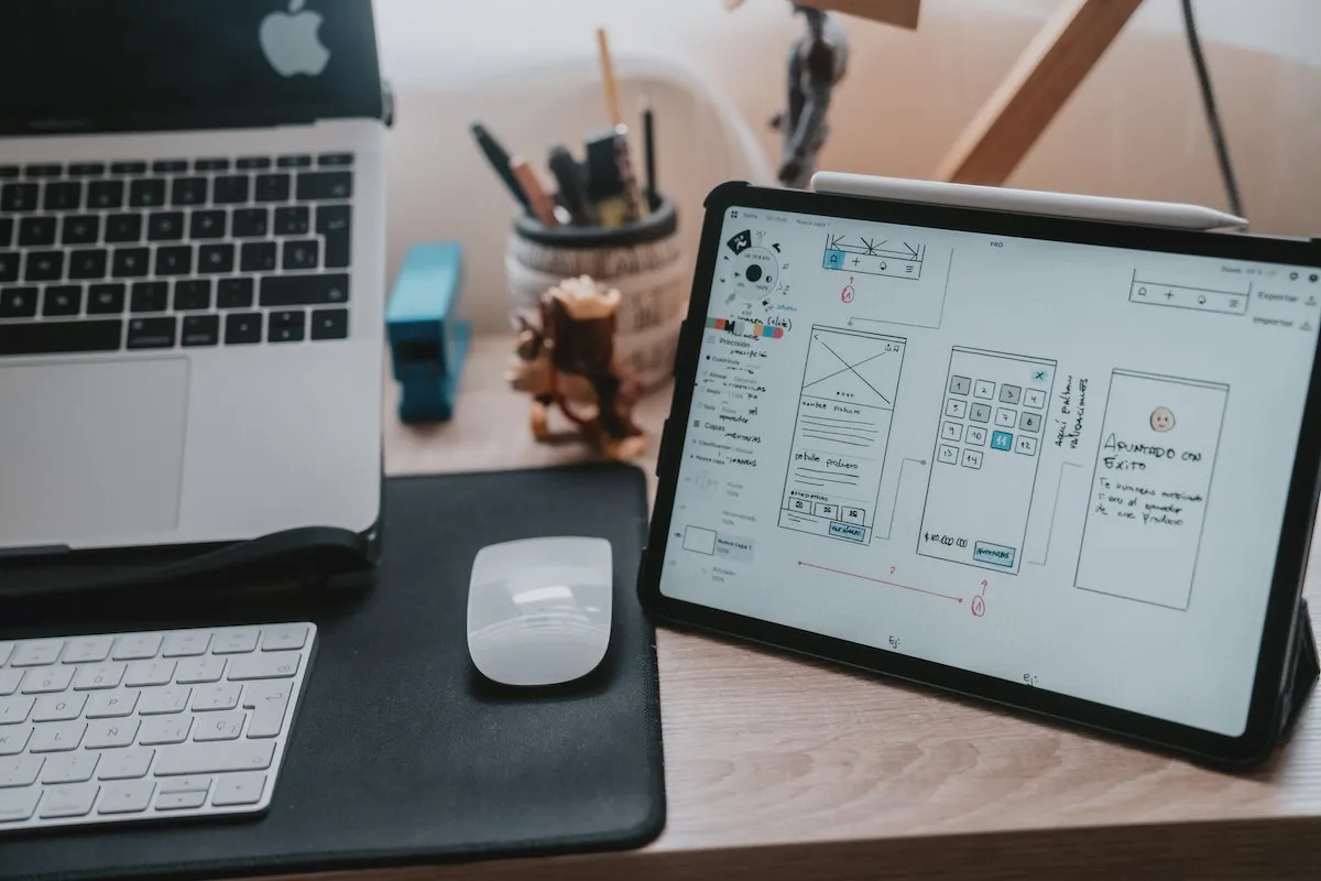
Create Sketches and Wireframes
Next is to create sketches and wireframes. Here, each Webflow SEO expert on the team develops ideas, and the team discusses them. Eventually, sketches of the website design will establish the buildout process. Once the final sketches are approved, wireframing can begin. Wireframes are also known as low-fidelity designs.
Best Practices for Creating Content Mockups
Mockups, or high-fidelity designs, are next. Research the best practices for UI mockups for the latest guidelines and tools for mockup creation. This will include all your previously defined UI elements. Your mockups should look like what you expect the final pages to look like. Prototype your mockups and send them for usability testing. After effecting changes from the usability testing (if any), you’re ready for hand-off.
UI Design Hand-Off to Development
A hand-off occurs when you hand over the finished design to the development team. In certain instances, you may present your prototype to stakeholders or the entire department before handing it over to the development team. Here, you will receive feedback and might be required to revise parts of the design.
Fundamental Webflow UI Design Principles
There are many principles guiding UI design. Practicing them will help with website conversion. Here are a couple of core values that our Webflow SEO expert team uses as a guideline for developing stunning sites.
Simplicity in Web Design
Simplicity is one of the core principles of UI design. Design intentionally, and remember to prevent getting carried away with creativity that you forget usability and simplicity. While aesthetics are important, usability is the main reason for the interface. Complicated designs confuse the user and distract them from performing the primary functions required of them.
Consistency in Web Design

Make user interfaces consistent. Use the same design elements like color, terminologies, icons, screens, menus, buttons, and commands. When your design has various styles, colors, fonts, and other elements, this places you at risk of a clash. Clashes often leave the user confused.
Prioritize User-Friendly Web Design
Your users have visited other platforms and are familiar with how interfaces work. Don't disrupt this experience. Consider predictability while designing your UI to prevent user confusion. For example, users are used to having the menu at the top of a page. It’s best to leave it there to make usability easier for the user. Putting it somewhere else might destabilize the user, and that’s not what you want.
Feedback Web Page Design
Feedback is essential as a user journeys through an interface. Feedback leads them to their goal, lets them know when they have accomplished a task, or alerts them when a wrong action has occurred. Feedback can be given verbally or graphically, such as when a tick appears on the screen to let the user know they have completed their intended activity.
How to leverage UI design to boost website conversions
Have an Attractive and Clear Call-to-Action (CTA)
Call-to-action (CTA) buttons are important when it comes to boosting website conversions. They determine whether your visitor will convert to a customer or not. The shape, color or words of certain CTAs can put off the visitor and bounce them off your website. Research best practices for designing higher converting CTAs to know how to craft ones that will lead to conversions.
Make your Content Concise and Clear
The information you put on your website, as well as how you put them, affects your conversion rate more than you know. Lumping a mass of words is not reader-friendly and might send your visitor jumping off your website as soon as they land. Instead, our Webflow SEO agency recommends arranging short pieces of content in batches to make it readable. Also, make use of bullet points and bold highlights; they easily grab the user’s attention.
Leverage White Spaces Effectively
If your website is choked, with words filling everywhere, it’s a sign your website needs an upgrade. When you put sufficient white spaces around words, it improves the user’s focus and gives them an overall better user experience. Well-distributed white spaces make it easy for the user to navigate a website. This makes them want to stay longer on your page, increasing the chances of conversion.
Use Colors Efficiently
Colors play a vital role in website design. Using the right combination of colors for your website grabs your user’s attention, making them attracted to your website. Don’t choose colors carelessly. Be deliberate about your color combination. Factors to consider when choosing website colors include branding and the purpose of the product.
Let Every Design Element be Distinct
Make good use of contrast to distinguish between all your design elements. Doing this will increase your website conversion. For example, set CTAs apart so that they draw attention to them as soon as the visitor gets to a page. Use different fonts and colors to do this. Also, let headlines be different from sub-headlines. These contrasts captivate the visitor and make them want to explore your website, boosting conversion chances.
Make Good Use of Visuals
We all know how captivating images and graphics are to any design. Leverage this to improve your website conversion. People generally get more drawn to pictures than words. Engagement is greatly increased when visuals like pictures, GIFs and animations, among others, are used on a website. The more engaged your visitors are, the higher the likelihood of conversion.
Improve Loading Speed with Functional UI
Loading speed optimization is usually the job of engineers. However, a good UI design helps to reduce website load time. For example, getting rid of unnecessary features that complicate the user journey helps speed up the website. When the user is able to navigate the website quickly, their journey is smoother and their chances of getting converted are higher.
Trust Leaders in Webflow UI Design for Maximized Website Visibility
Red Shark Digital’s dedicated Webflow professionals launch responsive, optimized sites that address your user’s needs, solve your current website issues, and work with your business to maximize visibility. As North Carolina’s sole Webflow Professional Partner, we offer the leading Webflow development services to various industries of all sizes. Discover the power and possibilities available to your business website with our Webflow agency. Give us a call to kickstart your new business website!
About the Author
Moyofade Ipadeola is a Content Strategist, UX Writer and Editor. Witty, she loves personal development and helping people grow. Mo, as she’s fondly called, is fascinated by all things tech.
One Focus:
Keeping You Up To Date.
Digital marketing news delivered to your inbox without the fluff...Maybe a little fluff....The cute kind 🐶!