


Figma to Webflow: Creating Responsive Web Design in Greenville, NC
Figma to Webflow: Creating Responsive Web Design in Greenville, NC

August 16, 2023
Updated:
August 16, 2023
Featured & Recent Articles


.webp)


January 18, 2022
Updated:
August 16, 2023
Figma to Webflow: Creating Responsive Web Design in Greenville, NC
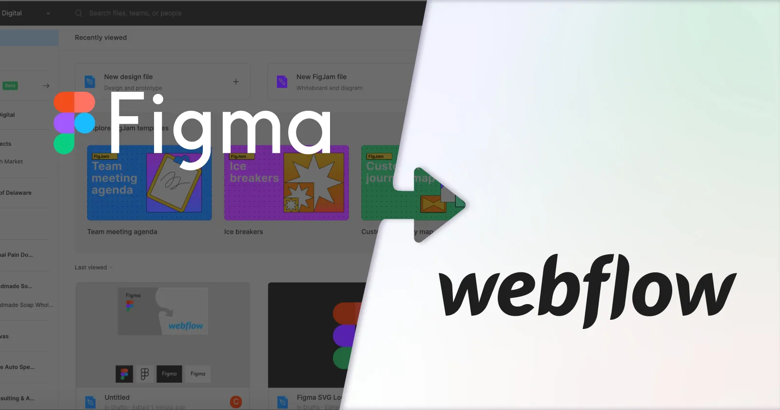
Figma and Webflow have become two modern digital platforms that elevate our Webflow development agency projects and design to another level. The seamless prototype-to-publish process between the responsive design Figma features correlated with Webflow couldn't be easier to transfer a prototype into a working website. These two platforms shape the digital landscape, and this is how our Webflow web design agency can help design, create, and deliver a responsive web design for any business.
Starting in Figma: Why We Do It
Figma serves as a versatile design and prototype platform, streamlining the process from the concept of responsive design Figma to responsive-first Webflow development. Figma allows our designers to create, design, and conceptualize our design concepts and the business owners' ideas to ensure the client is happy, and so is the website's responsive design. In the ever-evolving world of web design, the synergy between tools like Figma and Webflow has become paramount for a seamless user experience. Starting in Figma and using the platform as a playground to bounce around ideas is an essential step at our Webflow web design agency before implementing the final product, and this approach has shown to have many benefits:
Builds Consistency and Efficiency
Our Webflow development agency strategically designs your web frames in Figma, offering ample benefits. Implementing spacing rules based on scales (commonly 8 or 4) infuses a sense of order across your site. Consistency is vital, not only within a single page but also across different sections. Maintaining uniform spacing between titles, headings, and paragraphs ensures that your responsive web design retains its harmonious look across various breakpoints.****
Develops a Figma Responsive Prototype Early On
Figma's prototyping functionality proves invaluable for businesses eyeing a polished website without numerous revisions. Presenting your client with a prototype link simulates the user experience and helps align visions early in the process.
Pioneers Responsive Web Design Figma and Animation
Curating a responsive Figma prototype enhances your Webflow responsive design to the next level. Integrating auto layout, components, and constraints sets the stage for a seamless transition to Webflow. While these design elements can await development, gaining client approval ensures a smoother handoff, minimizing potential revisions.****
Seamless Webflow Responsive Design Development
From starting in Figma to developing in Webflow, embarking on utilizing these two digital platforms allows for a seamless craft of a captivating and responsive Webflow website. Let our experts review the steps and strategies to generate a successful, responsive web design.
Step 1: Export and Upload Assets
The initial step in your responsive design Figma-to-Webflow transition involves exporting and uploading assets. These encompass your website's text styles, color palette, and media components. An organized Figma workspace becomes your ally, efficiently locating and transferring essential elements. A structured media naming approach for expansive websites can be a game-changer in simplifying asset management.
Step 2: Strategic Breakpoint Sequencing and Webflow Mobile Responsive
When creating a responsive design in Webflow, consider its unique cascading style approach. Begin with desktop breakpoints, then move to mobile. With bi-directional cascades, styles flow from desktops to smaller and larger screens. This approach enables our Webflow website design Greenville NC team to fine-tune mobile views without disrupting larger screens, giving you better control over design responsiveness.
Step 3: Allow Room for Creative Adaption
Prototypes offer a sneak peek into your design's flow, but nuances in animations and transitions might differ in execution. Allow room for creative adaptation, recognizing that the precise prototype effects from Figma might require tweaking in Webflow. Rather than chasing pixel-perfect replication, allocate your efforts towards refining smooth and functional animations within the Webflow environment.
Elevate Your Digital Presence with Red Shark Digital, An Expert Webflow Development Agency
As a business owner, having a dynamic online presence and our responsive Webflow website design Greenville NC agency by your side allows for a more significant user experience and enhances SEO. Working with our experts ensures seamless planning, creating, designing, and developing collaboration. Contact our Webflow development agency today to learn more about how our creation process and development can help your business enhance its online presence!
One Focus:
Keeping You Up To Date.
Digital marketing news delivered to your inbox without the fluff...Maybe a little fluff....The cute kind 🐶!
