What Businesses Can Learn from Instagram's New Wordmark
What Businesses Can Learn from Instagram's New Wordmark
September 2, 2026
Updated:
September 2, 2026
Featured & Recent Articles












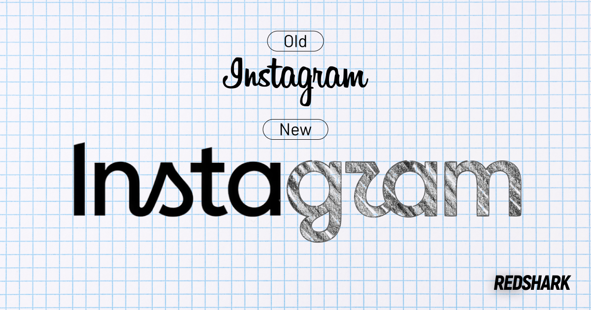
The Instagram new wordmark has officially been announced, introducing the platform's first major typography refresh in almost ten years. Although the update is subtle, it has sparked widespread discussion across the design and marketing communities. For businesses, this Instagram logo update is more than a visual refresh. It highlights how thoughtful brand evolution can keep a company recognizable while adapting to changing user expectations. At Red Shark Digital, we know that even subtle design changes can have a lasting impact when they're backed by strategy rather than trends.
Why Instagram Updated Its Brand Identity
The refreshed wordmark logo replaces the flowing script introduced in 2016 with a bolder, more structured design. According to Instagram Director of Product Design Jasmine Probst, the update supports the platform's evolution from a photo sharing app into a multi format experience built around Reels, messaging, and creators. It also improves readability across today's digital devices.
Businesses can learn several lessons from Instagram's creative redesign:
- Brand updates do not have to be dramatic to be effective.
- Readability and usability are just as important as aesthetics.
- Consistency across every platform strengthens brand recognition.
- Visual identity should evolve as your business grows.
Creative Team Perspective
“When it's time to do a rebrand, it's more important to know why you're doing it than doing it just to do it. For Instagram, I think it's because their wordmark has looked the same since it launched, and it was never fully UI friendly. I respect that they went their own way instead of following the 'Uber/Airbnb effect' every other app seems to chase. That said, I'm not sold on the new R at a quick glance, it barely reads as an R.”
~ Alex Kettler, Associate Creative Director at Red Shark Digital
Alex's perspective highlights an important takeaway for businesses. Successful rebrands aren't driven by trends, they're driven by purpose. A strong brand should evolve to better serve its audience while preserving the recognition and trust it has already earned. At Red Shark Digital, we help businesses identify when it's time for a strategic refresh, ensuring every branding decision supports long-term goals, improves the customer experience, and maintains consistency across every touchpoint.
Great Branding Evolves with Your Business
Small Changes Can Make a Big Difference
Many companies assume rebranding means replacing everything customers already recognize. Instagram’s new wordmark took the opposite approach by refining an existing identity instead of starting over. Rather than abandoning the handwritten style that has become synonymous with the platform, the new Instagram logo pays homage to its previous identity by preserving familiar script elements while introducing a more modern, structured look. By maintaining visual continuity, Instagram reinforces brand recognition while proving that the strongest brands often evolve through intentional refinement rather than dramatic change.
Businesses Should Think Beyond the Logo
A logo is only one part of a brand identity. Your website, social media, advertising, messaging, and customer experience should all work together to create consistency. When every touchpoint reflects the same visual style, tone of voice, and core values, customers are more likely to recognize and trust your business. Even small inconsistencies can create confusion, while a cohesive brand experience builds credibility and strengthens long-term recognition.
Great branding isn't just about creating something that looks good. It's about creating an experience that is recognizable, consistent, and easy for people to interact with across every touchpoint. The American Institute of Graphic Arts (AIGA) emphasizes that effective branding builds recognition through consistent visual communication, reinforcing the value of a cohesive brand identity over time.
Marketing Perspective
"I think the new wordmark feels more modern and personal. There's been a big push in social media toward being more 'authentic' and less polished, and I think this new wordmark leans into that. Transitioning to something that feels handwritten but still modern makes the brand feel less corporate and more human."
~ Hannah Eccleston, Paid Advertising & Social Media Project Manager at Red Shark Digital
That same principle extends beyond visual design into the digital experience. Google Search Central highlights the importance of creating user focused content and experiences that prioritize clarity, usability, and helpfulness. Together, these principles reinforce why Instagram's wordmark logo update was more than a cosmetic change. It was a strategic decision to strengthen both brand recognition and the overall user experience, something businesses of every size should consider as they evaluate their own branding.
What Your Business Can Take Away from Instagram’s New Wordmark
Instagram's new wordmark shows that successful brands do not change simply to follow trends. They evolve intentionally to better reflect who they are and how customers interact with them. Whether you are considering a visual refresh or evaluating your overall branding strategy, thoughtful updates can strengthen recognition without losing what makes your business unique. Red Shark Digital helps businesses build brands that grow alongside their goals through strategic branding, web development, and digital marketing solutions. Explore our services to see how intentional design can help position your business for long term success.
One Focus:
Keeping You Up To Date.
Digital marketing news delivered to your inbox without the fluff...Maybe a little fluff....The cute kind 🐶!