


From Legacy to Identity: Rebranding North Carolina School for the Blind
From Legacy to Identity: Rebranding North Carolina School for the Blind
September 28, 2026
Updated:
September 28, 2026
Featured & Recent Articles











September 28, 2026
Updated:
September 28, 2026
From Legacy to Identity: Rebranding North Carolina School for the Blind
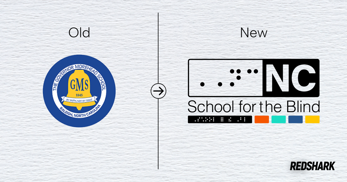
A school’s brand can carry decades of history, but that doesn’t mean it always communicates that history clearly. For Governor Morehead School for the Blind, that meant taking a closer look at how the school’s name, visuals, and messaging represented its mission and statewide role. The result is a broader school rebranding effort centered around a new identity built to represent the school for years to come. The work gives Red Shark Digital an opportunity to turn more than a year of research and discussion into a brand that reflects both where the school has been and where it is headed.
When a Name Needs to Say More
The decision to move away from the Governor Morehead School name came from a need for greater clarity. Committee research found that the existing name did not immediately communicate that the school serves blind and visually impaired students or that it has a statewide role. At the same time, the school has a deep history and strong connections among students, families, alumni, staff, and supporters.
The move toward North Carolina School for the Blind creates a more direct connection between the school’s public identity and its mission. Importantly, the committee viewed the change as an evolution rather than a rejection of the past. The institution has gone through multiple name changes throughout its history, making adaptation part of its story rather than something separate from it.
Designing With Accessibility in Mind
For this brand identity, accessibility is not an afterthought. Braille has been identified as a major part of the visual direction, creating an opportunity to incorporate an element that is directly connected to the students and community the school serves. The committee also explored how Braille could work alongside letters, patterns, shapes, and color to create a visual language that feels intentional rather than simply decorative. That approach gives the identity a connection to the school’s mission while opening up more possibilities for how the brand can be used across different materials.
The visual direction also explores a strong black-and-white foundation paired with four purposeful accent colors. The number four has a connection to the physical campus, where both Lineberry Hall and the gymnasium feature four front pillars. The goal behind the colors is to give the palette a recognizable role within the larger system. Color could appear through shapes, bars, blocks, repeated elements, or other design applications, giving the school a system that can remain recognizable without relying on the logo alone.
One Identity, Many Applications
A successful visual identity has to work beyond a primary logo. The committee identified inconsistencies across departments, athletics, publications, signage, campus spaces, digital media, merchandise, and other public-facing materials. The goal of the new system is to bring those applications together under one recognizable framework while still allowing different areas of school life to have their own personality.
That flexibility is especially important for a school identity that needs to serve students, families, staff, alumni, and the broader North Carolina community. The branding needs to translate across everything from athletic uniforms and event materials to campus signage and family communications without becoming difficult to use. By creating intentional standards for color, typography, logos, and supporting elements, the school rebranding can give the school a stronger foundation for communicating consistently well beyond the initial launch.
Honoring What Came Before
Perhaps the most important part of the project is making room for the school’s complete history. Committee research emphasized both the Governor Morehead School legacy and the Garner Road legacy, including the Greyhounds story and the history of the segregated-era campus. The committee made it clear that a successful rebrand cannot simply focus on the school’s most recent identity or leave difficult parts of its history behind.
For Red Shark Digital, this school rebranding project demonstrates why meaningful branding starts well before the design stage. The research, history, accessibility considerations, and institutional goals all help shape an identity that can serve the school beyond a new logo or name. Through thoughtful strategy and design, Red Shark Digital helps organizations build brands that are recognizable, purposeful, and built to last. Contact Red Shark Digital today to explore how our branding services can help your organization create an identity with purpose.
One Focus:
Keeping You Up To Date.
Digital marketing news delivered to your inbox without the fluff...Maybe a little fluff....The cute kind 🐶!